When hosting a good presentation, made in Prezi, Powerpoint or any other software, you need to know some of the basics of what can engage an audience that will listen with interest and remember the words or story you have told. Whether your presentation is in delivering a lecture to students, showing a number of middle managers the latest sales figures or providing a presentation to a sports team on an important match coming up, you should always give it a start, a middle piece with the body and an end point.
The start should be the introduction, a synopsis of what you are going to present and why. The middle part of the presentation is the guts of what you will be presenting and this is the main part. The end of the presentation should be the rounding up part where you have the opportunity to engage questions from those in your audience.
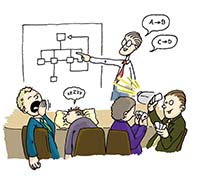
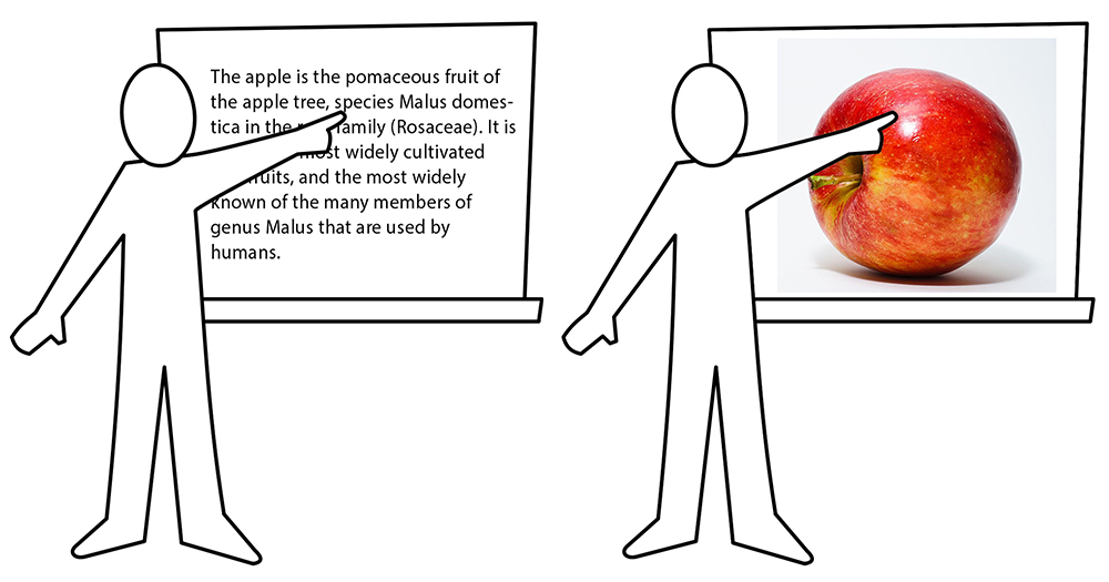
Many presentations tend to overlook the fact that flashing slides or images with sound bites are just dull company speak, and are really not needed. This is one sure fire way to bore your audience and should be avoided at all costs. Always optimize your texts and write everything with as few words as possible so it would be easier to read for your audience. Consider replacing some texts with images as people even think using pictures.
 What is an apple? Text vs Picture. Always use illustrative pictures as they are instantly understandable.
Whether you are hoping to engage your audience with a sales pitch hoping to get approval from a small team of middle management or you are providing a health and safety presentation to new starters at the local office, you need to keep all your slides uniform. That is you must use the same background throughout, same font and font size, and never let your presentation drag on for more than 20 minutes. If it is going to take longer, you should factor in some breaks for a coffee or comfort stop.
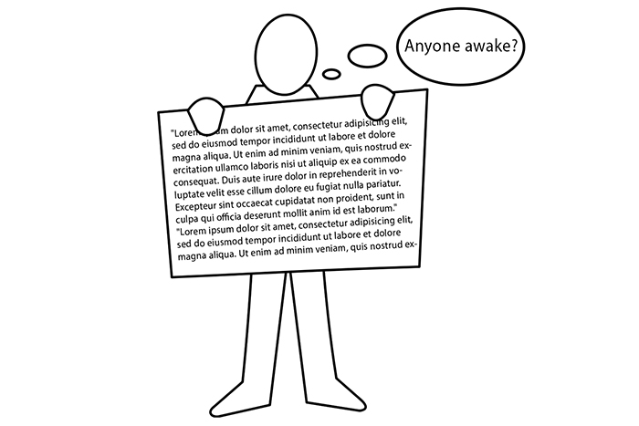
 Don`t bore people with too long presentations filled with plain text.
Beyond this your audience may start to lose their attention span and the vital information you had hoped to deliver may end getting lost as tiredness or boredom sets in. It is also worthwhile every now and again throughout your presentation to involve your audience from time to time. But be careful not to let one of the listening audience starts taking over with too much chat and talk. Remember, you are leading this presentation and you must ride and drive it and not let others waste too much time so that it upsets your flow.

