In 2016 Prezi added a new Charts feature, which automatically generates 4 types of different charts from your input data table. Unfortunately this feature is currently only available for premium accounts.
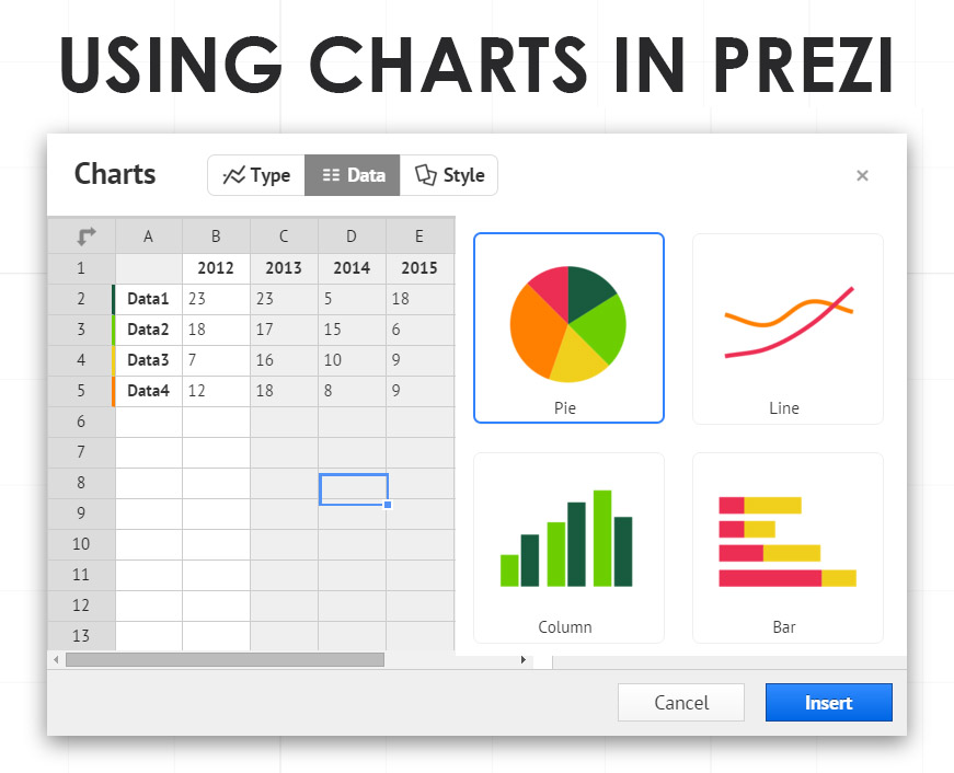
Using the Charts interface itself is pretty simple: you can insert your data once and then customize the generated chart type later. It is possible to change all the colors and even configure whether to display labels, legends and values. The bad news? The charts are not zoomable and are generated as raster images. However there is not much to complain about, as the charts are pretty customizable and it was a long awaited feature. Here is a short preview video:
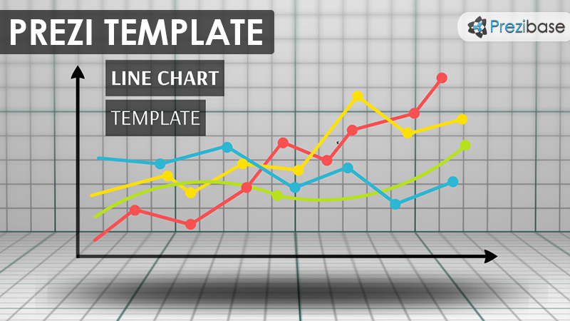
Prezibase Chart Templates: